SparkChronicles
Home
News
USA
Entertainment
Sports
Business
Technology
Games
Health
News
Are You A Selfish Spouse? These Signs Are Indication
April 2, 2024
0
1,893
Health
Turmeric To Dry Fruits, 5 Foods To Help Cleanse Your Liver
April 2, 2024
0
628
Health
Easy Ways To Prevent Skin Allergies In Summers
April 2, 2024
0
608
Health
Essential Anti-Ageing Morning Rituals To Achieve Radiant Skin
April 2, 2024
0
608
Uncategorized
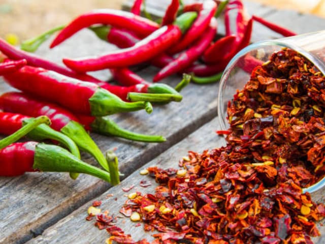
Beat the Heat: 5 Spices You Must Avoid During Summers
April 2, 2024
0
574
Health
Fenugreek Seed Water To Cinnamon Tea, Drinks To Regulate Blood Sugar Level
April 2, 2024
0
600
Entertainment
Sobhita Dhulipala Radiates Charm In Chic Blazer Styled With Fish Cut Nude Skirt, See Pics
April 1, 2024
0
668
Entertainment
Rakul Preet Singh’s Chikankari Kurta Is A Must-Have In Your Summer Wardrobe
April 1, 2024
0
611
Entertainment
Vaani Kapoor Redefines Ethnic Magnificence In Nude Pink Pre-Draped Saree, See Pics
April 1, 2024
0
773
Entertainment
Neha Sharma: Unveiling the Secrets Behind Her Radiant Beauty and Fitness!
April 1, 2024
0
579
Next page